Duolingo UX/UI Best Practices: Lessons for Product Designers
Duolingo is not only one of the most popular educational apps in the world—it’s also a brilliant UX/UI case study.
In this post, we break down Duolingo’s best UX/UI practices and the key takeaways product and design teams can apply.
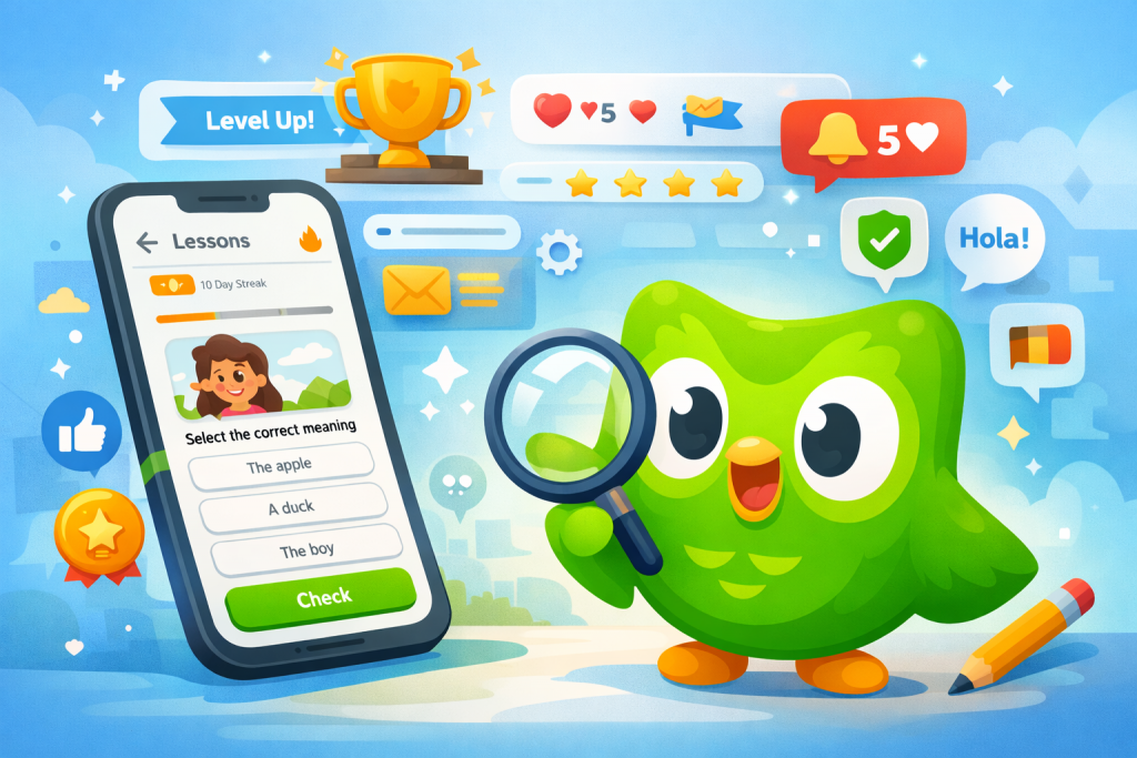
1. Gamification That’s Purposeful (Not Superficial)
Duolingo turns learning into a game—with clear UX intent:
- XP points, streaks, and leagues encourage daily habits.
- Rewards are tightly aligned with the core goal: practice.
- Progress is always visible, reducing anxiety and boosting motivation.
UX takeaway: Gamification works best when it reinforces the desired behavior instead of distracting from it.
2. Progressive, Frictionless Onboarding
Duolingo avoids overwhelming users at first contact:
- It doesn’t explain everything upfront.
- Features are introduced just in time, when they’re needed.
- Users can start learning within seconds—even before signing up.
UX takeaway: Less upfront explanation, more contextual learning.
3. Microinteractions With Personality
Animations, sounds, and reactions from the iconic owl aren’t just decorative:
- They reinforce correct actions.
- They soften mistakes without punishment.
- They humanize the experience and build emotional connection.
From a UI perspective, every microinteraction serves a clear emotional purpose.
UI takeaway: Well-used motion design communicates feedback, status, and tone.
4. Simple, Highly Consistent Visual Design
Duolingo relies on a strong, recognizable visual system:
- Vibrant but controlled colors.
- Large, readable typography.
- Clear, repeatable iconography.
Consistency reduces cognitive load and allows users to focus on learning—not on understanding the interface.
UI takeaway: A solid design system scales better than isolated “creative” solutions.
5. Immediate and Continuous Feedback
Every user action receives a response:
- Correct/incorrect feedback is instant.
- Errors are explained without frustration.
- Progress updates in real time.
This keeps users in a continuous loop of action → feedback → motivation.
UX takeaway: Fast feedback reduces friction and reinforces learning.
6. Data-Driven UX and Constant Experimentation
Duolingo is well known for its experimentation culture:
- Continuous A/B testing.
- Small, incremental changes.
- Decisions based on real user behavior—not just intuition.
This results in a highly polished experience that constantly evolves.
Product takeaway: Great UX is a process, not a final deliverable.
7. Accessibility and Inclusive Design
The app supports a wide range of abilities and contexts:
- Clear, simple language.
- Large, touch-friendly interactions.
- Flexible pacing for different learning styles.
UX takeaway: Designing for more people increases a product’s overall impact.
Conclusion
Duolingo proves that great UX/UI isn’t just about looking good—it’s about:
- Deeply understanding user motivation.
- Designing systems that build habits.
- Blending data, psychology, and visual design.
For UX/UI designers, Duolingo is a living masterclass in creating experiences that are useful, human, and addictively good.